Friday, October 19, 2007

Assignment 6 - Commercial Photography -Interpretation of images


Chosen Ad
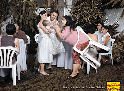
Nagaraya Nuts
Advertising Agency: PC&V Communications, Philippines
Slogan: Time to go for zero trans fats and zero cholesterol. Nagaraya.


About our presentation:
My team explores on how the target audience will see the ads, in what it the ads effective in targeting their consumers using theories and models of communications and how we as students interpret the images from an outside perspective considering that we are not based in Philippines.

Models Used to Interpret
1. Elaboration Likelihood model explain why the ad uses humor, it is most suitable for products that require low involvement.

2. Peire’s Theory – iconic, indexical, and symbolic to infer meanings and messages
Symbolic:
Guests and baby - celebration of newborn (image)
Trans fat -bad for health (caption)
Iconic
People-Philipinoes
Indexical
Chair stuck to her butt -she is too fat
When ties in with the caption, it means that she should eat Nagaraya nuts

3. Tropes
Metonymy

Trans fats and cholesterols signify over weight
(Commonly associated)
Synecdoche
The woman’s butt is too big denotes her as being overall too fat and needs a solution
( butt refers to fat body and butt is part of the body)

4. Connotations and Denotations
In this ad, both connotations and denotations derived into the end message that the woman is too fat that she is stuck with the chair, thus she should go for lower fat intake, which is to eat Nagaraya nuts.


How Target Audience Decode the Message
First, the target audiences are really based in Philippines, those who are fat or think they are obese and als0o people who are obsess with the ideal image of slim. The used of Philippinoes in the ads is the right choice as audience could relate with the people in the print. It is also a realistic depiction of a gathering of a celebration of the new born. Audience can infer this from their cultural background as Philippines is known for their warm and celebration of festivals. Nothing absurd is inserted in the print, even when the chair is stuck; it is something that could really happen, not surrealistic e.g people flying in the sky. The use of ordinary people also allows audience to relate themselves as being in her shoes or even in that scene (especially with the availability of the white space in the front of the image).

Fat being not desired by people is an almost universal thing, in Philippines and in Singapore. The image of ideal beauty is so common that little kids could tell you who is fat and who is not. Trans fats and cholesterol whether one has taken chemistry or not know what when the level is too high, it is bad for health and it is commonly associated with fat people. These are the most common terms used in slimming products and fats free products.

Also mentioned in our presentation, the use of humor on this topic, could have two extreme effects, some may be offended and see it as a mockery to fat people, while others will accept it as just for laugh. This depends on how seriously people view adds, their psychological state, like self-esteem, self satisfaction and their cultural background.

References are also made to the everyday life, be it the audience or us. Fat people are pressured by society to lose weight and to fit in. The ad pokes fun at embarrassing situations E.g the fat lady in the chair, the fat guy falling asleep in front of the TV and the butt crack. People are pressure to be in ideal shape. Beautiful people also have a fear of growing out of shape and losing their beauty. Ad speaks to them because it’s catching their weak point.

Other supporting ads:
Advertising Agency: Salles Chemistri, Sao Paulo, Brazil
Slogan: Forget about it. Men's preference will never change. Fit Light Yogurt


Peers' Work
I felt that many of the groups speak more about how they interpret the ads rather than how the targeted audience will interpret the ads. Really a lot of effort put in the theories portion. I am commenting on the below based on my memory because not everyone has put up their blog yet. I shall expand on this section once I check on others’ works.

Paul and Mei mei's ad was well chosen, although not many of us are familiar with gambling, but we are still able to infer the meanings from the ads, the use of polka cards and chips are something familiar to use as audiences of mass media, we see these in movies, the image of Les Vegas is also shaped by movies (for those who has never been there). I love what Paul and Mei mei code the “Death of the author and the birth of the reader”. Really when an author of a book finished his/her job, it is published and from that instances, the author will not have the ability to change anything in the book, the author is not there to explain to the reader exactly how he should read it.

For paintings, once the artist finished a painting, he died and the painting became famous and there is this ‘great rush’ to interpret his works, many interpretations but who knows which is the correct one, after all correct or not is not important, there should be freedom of how one should interpret the work based on one’s cultural experience. Paul and Meimei where did u get this code from? I thought Paul and Meimei did a great job, very detailed, analytical documentation of theories and how it is applied to human interpretation of images.

Gaze-Adding on to what Mr Reddy taught in class this week

Manet (1863) Luncheon on the Grass


Manet (1863) Olympia

Mike and Zhen Qin, I remember this presentation cos we have the print outs Haha. I am really interested in the topic of how to interpret the fashion magazine ads, especially the idea of GAZE.
According to Newman (1990), looking is a language; it is a mode of telling and a source of pleasure. According to him, male gaze in western context is structured for the privilege of man and a means of relegating women to the status of an object or what we usually call objectification. The gaze of man on woman can be sometimes interpreted as visually molesting the woman and in print ads, they are decoded as woman being a servant and giver function, a pleasure and a partner. Objectification can be expanded to more arena really than just being under the gaze of man. According Baker’s (2005) analysis on ads being the purveyor of women sexuality, the definition of objectification is woman functions as to look attractive only. They could be posed in awkward position or just focusing on some parts of the body to the extent that it is striped off from the actual human form.

At the first glance on the ad they presented, people may immediately think that the woman is subservient to the man and dependent on him. From Goffman’s (1979) analysis it be inferred as that because of how she is seated, bending towards to the man. However, the gaze tells other wise. The gaze is looking directly at the camera, a strong and confirming look. From here, the man is the pleasure; there is a change in gender role here. This also reminds me of Manet’s Olympia (1863). In the painting the woman is staring confidently at the viewer, as if insulted or threatened by her look, there was an uproar against this painting at that time. Likewise in the Luncheon on the Glass (1863), Manet again challenge the idea of gaze, that man now becomes the subject of the woman’s gaze. The nudes in his painting seem to challenge the viewer, “Are you looking at me, I know you are looking at me.”

I thought if Mike and Zhen Qin read up on Manet, they would have draw lots of interesting insights from his master works. Erm…. and also I still don’t understand why you mentioned Siva Natarajar. In Hinduism, Siva is equated to destruction. Natarajar is an aspect of Siva; it is the Lord of dance and music. So Siva Natarajar embraces creation, destruction and preservation. The unique thing about it is that it seems to be always in movement. It is said the “the figure never really stand and sit, they stand and sit in movement,” TK Sabapathy (2006-2007). So I really find it hard to relate a religious sculpture to this fashion ad. =)

On Second Thought
Look at the paintings by Manet and look again at the ads above from my presentation, don't you think their image of beauty is the same? So why look at them as fat people? Answer: exactly! It is our cultural experiences, social norms and influences that internalised in us that fat is unpretty. ( Of course they are some exceptions, some may still think they are pretty).

(*updated)Self Assessment:
I am giving my group 100/100 because we need answer to what Mr Reddy is loooking for, applying the concepts of semiotics at the same time using other models and defining how the target audience will look at the ads and how effective they are. We also make use of examples of other ads to support the one we used. The issue we presented is soming familiar to the class, thus when we present the slides, they could understand and able to relate it to their own societal standards and environment.
Tuesday, October 16, 2007

Assignment 5

Another series which was not presented in class, just wanna share these perspectives of mine =p
Expressionism - most Singaporeans live in HDB flats, it looks like everyone dwells on same stuff and do the same things everyday, but what is inside each cubicle is customized to that one person. The way he look out from his window, his habbit of hanging the laundry and how he look at the sky above him.
Realism - evening shot of the HDB flats in Sengkang

Formalism- To me I like the patten form by the architecture of the HDB flat, what is unique is how this struture overlapsed with the nice blue sky. I like the contrast between the dynamic sky and the static building structure. It reminded me of my 2nd assignment which I capture the architecture of a school.
Posted by Picasa

Saturday, October 13, 2007

Assignment 5- creep 2

Creep as define as the feeling of being followed and monitored or Paparazzi. Also the form is focus on the cracked and dirty lines as creep also means deformation.
Creep as a form - is deformation, the fluid of paint seems to be melting off.


The creep of being captured and monitored. The illusion of what is facts and false as reported in the press is captured here, the triple visions. It is not really the wall and the photographer, it is a reflection on a van.


Realism, a building what seemed so enclosed is actually brightly colored and open!

More to come...

Wednesday, October 10, 2007

Assignment 5-Creep

Creep is a very subjective and abstract word. In my series, I play around with how the ladder with two pails is creeping into the frame. More significantly I want to portray creep as a feeling of being rejected.

Location: Chinatown narrow alley
Formalism - focusing on the design and patten rather than what it is. Here there is a pair of rounded rectangular curves with verticle lines, contrasting with the soft and weak strings.


Expressionism 1

The class felt that it is too similar to the realism picture (last photo). Mr Reddy felt that he couldn't feel what I was really trying to portray.

Expressionism 2

After the class, I was actually feeling quite down about it, cos it was after so much hard work it seems to be down to nothing. Suddenly this pciture came to mind. I actually have a close-up picture of the pails. So I got down to work on it. The metal pail is used as a burner for joss paper during the hungry ghost festival, after that it is just left aside. Its pal is the red mop pail, after we clean the floor, it is just conveniently left to dry and out of our sight. It feels so sad to be 'rejected' and stripped off from its original purpose and use- creep craws all over one, when one feels he or she will be replaced soon.

Post production: desaturation of background, emphasis on the redness to grab attention.

Realism- the back alley and how exactly the pails are placed.

I feel that after the revision I am giving myself 97/100 for the good perspective and concept.

Others' works
I like Jasmine's work, I think she nailed the concept pretty well, showing how the newspaper were splattered and focusing the newspaper being torned and wet by the paper and finally how she express it as stress, how it could be a creep feeling when someone is stress yet she can't help. There is a lot of emotional attachment, yet she is able to objectivity take the other two pictures without being too emotonal. I will give her 95/100

Next, Jillyn's work seems to impress the class but until I heard that she actually moved the snail, I felt that the whole concept just falls apart. Realism being constructed is not realism any more. It is just like a still-life painting, when the artist purposefully placed the objects in a manner he wants to. Her concept is the idea of snail creeping or rather that is the way I see it. No bad feelings please. There is a lack of deep thinking especially for the expressionism photo. Maybe is the different way we defined the terms.

Challenge
Being already 'trained' to look at things in different perspectives and having so much exposure to different literature and culture we are affected by these while taking pictures. We tend to include our interpretations. Photography means to frame something, is already not portraying the realistic and true value of an object/scene. However, what we can do is to try to treat it as objective as possible, imagine we are a journalist, we have to show public an unbias point of view.

This assignment is really looks easy but not easy Haha... till now I shall wait for the rest to upload their pictures before I can give more concrete comments.

Please do share with me your take on my revision work. Does it fit the theme and what I want to portray? Thanks =p

Sunday, October 7, 2007

Assignment 5- Realism, Formalism and Expressionism


Please tell me if these work,


I only have the formalism photos here...Haha I was so inspired by Mike's photo the other day, so when I spoted these red atas looking chairs along the shop houses at Chinatown, I just fell in love with them!

Friday, October 5, 2007

Assignment 4


The day after an artist’s perspective
Location: Pagoda Street –Shop house
Time: about 5pm. The sky was dark and was drizzling.


It is simple, playing with the dynamism of different perspective and the illusion of time. I started the first picture with the color one. It inspired me to build on the whole montage. After the so called ideal picture was taken, when seen the next day, the rest of the shop houses become part of the past, sense of nostalgia.

I venture into a few techniques for this picture; I try to create this fish eye lens on top, while ending with a almost concaving effect as the building collapsed into the ground. The achieved that the alignment of people may seem distorted but the idea was to create something that none of the wide angle lens can achieve. My concern is not so much of the people, rather the building. The details and lines of the building are used as guide to link up the building.

Challenge
It is lucky that the sky was dark and I manage to get this looming effect and the sky was not overexposed. Challenge is to take photos in the rain. I overlapped the pictures to cut out those that capture the raindrops.

(*updated)Grade
Ok since I got quite good feedback from the class, I am giving myself 100 for creativity, 100 for concept idea of montage and 100 for skills and technique. As a new photography there is really room for improvement.

Final Verdict: 100/100 , because after reading comments from the class and assess that I nail this week's assignment of how a montage which be read and presented.


Day after day – cai pen store damn hot (Chinese mixed food store)

I want to add a little humor towards the picture using the title. The picture may look serious but actually not so. Day after the queue for the stall is always so long. It seems always the same in all hawker centre that what stalls always have the best business. However many of times, we pay little attention to the people eating there. The exchanged of gaze, the self-absorbed. The two seemed oblivion to the que behind them.

I shot many shoots from different views and focal length, playing around with the viewer’s eye. There is little fish eye lens effect

Wednesday, October 3, 2007

Response to beach photo


Picture taken from Kaveh Photography, this guru takes great pictues. This is a good example of a beach shot, you can still have that silence feel to it, but you have more shades and dimension to the colors. Of course you can still change the subject matter, but this is the technique you can try =)